How to Create a Responsive Image Grid

What Is A Responsive Image Grid?
A responsive image grid is a way to arrange and display images on a webpage in a grid layout that automatically adjusts to the size of the viewer's screen. The images within the grid resize, reposition, and sometimes even change the number of columns based on the screen's size to provide an optimal viewing experience.
This concept is a part of responsive web design, a design approach aimed at crafting sites that provide an excellent viewing experience—easy reading and navigation with minimal resizing, panning, and scrolling—across a wide range of devices, from desktop computer monitors to mobile phones. Responsive image grids add to the visual appeal of a website, making it more engaging and user-friendly. They are commonly used in online galleries, portfolios, e-commerce product listings, and anywhere you need to display multiple images together.
The implementation of a responsive image grid can vary depending on the specific needs of your project. It can be as simple as a uniform grid of square images or as complex as a masonry layout of images of different sizes and aspect ratios, with automated CSS cropping of images to suit the required size.
Principles of Responsive Image Scaling
When implementing a responsive image grid, you should pay attention to the principles of responsive image scaling with CSS:
Fluidity: In a responsive image grid, images should be able to fluidly change their size to adapt to the grid structure and the screen size. This is typically achieved using relative units like percentages instead of absolute units like pixels for image widths.
Resolution independence: With a wide variety of devices and screen resolutions users may use to access the website, it's essential that images look crisp and clear on all screens. This could mean serving different versions of an image based on the screen resolution or using vector graphics that maintain their quality irrespective of the screen size.
Preservation of aspect ratio: When an image scales, it should maintain its aspect ratio to prevent distortion. In other words, the width and height of an image should always scale proportionally. This is particularly important in a responsive image grid where images need to maintain their visual integrity at all sizes.
Designing the Image Grid
Planning the Layout and Structure
When designing a responsive image grid, the first step is to plan the layout and structure of the grid. This involves deciding on the number of columns in the grid, the space between images (also known as gutters), and how the grid should respond at different breakpoints or screen sizes. For instance, you might choose a four-column grid for larger screens that breaks down to a two-column grid on medium screens and a single-column grid on smaller screens.
The layout and structure of the grid should be determined by the content it will hold and the context in which it will be viewed. For example, a portfolio website may benefit from a masonry grid that allows images of different sizes and aspect ratios to fit together seamlessly, while a product listing page might be better served by a uniform grid of square images for consistency.
It's also important to consider how the grid will function. Should images expand when clicked? Will there be a lightbox feature? How will the grid handle captions or other text associated with the images? These are all considerations that can influence the layout and structure of the grid.
Choosing the Right Aspect Ratios for Images
Choosing the right aspect ratios for images is another critical aspect of designing a responsive image grid. The aspect ratio of an image, which is the ratio of its width to its height, can significantly influence the visual harmony of the grid. Consistency in aspect ratios can lead to a more uniform and orderly grid, while varying aspect ratios can add dynamism and visual interest.
However, it's not just about aesthetics. The chosen aspect ratios should also serve the purpose of the images and the grid. For example, if the images are intended to be viewed in detail, a larger aspect ratio that allows for a bigger display size might be beneficial. On the other hand, if the grid is meant to provide an overview or a preview of the images, smaller aspect ratios might be more suitable.
When implementing a responsive image grid, it's important to ensure that images maintain their aspect ratios when scaling. This can be achieved through the use of CSS properties like object-fit and object-position, or through JavaScript plugins that calculate and apply the correct dimensions.
Considering Aesthetic Aspects
The aesthetic aspects of the responsive image grid should not be overlooked. The design of the grid should enhance the overall look and feel of the website and contribute to a positive user experience. The choice of colors, typography, and other design elements should be in harmony with the rest of the website.
The arrangement of images within the grid can also greatly impact its aesthetics. A well-thought-out arrangement can guide the viewer's eye through the grid, highlight important images, and tell a visual story. Techniques like the rule of thirds, leading lines, and visual hierarchy can be employed to create an engaging and visually appealing grid.
Tutorial: Making the Grid Responsive with CSS
CSS, or Cascading Style Sheets, is a language used to describe how HTML elements should be displayed. In this tutorial, we will walk through the steps of creating a basic HTML structure for your image grid, styling it with CSS, and then using media queries to adjust the grid layout on different screen sizes. Lastly, we'll also explore how to automatically crop images to fit the grid.
Create the Basic HTML Structure for Your Image Grid
The first step in creating a responsive image grid is to establish the basic HTML structure. The HTML document structure is like a tree with branches and leaves. The 'tree' is the HTML document, and each 'branch' and 'leaf' represent HTML elements, such as divisions (<div>), headings (<h1>), paragraphs (<p>), and images (<img>).
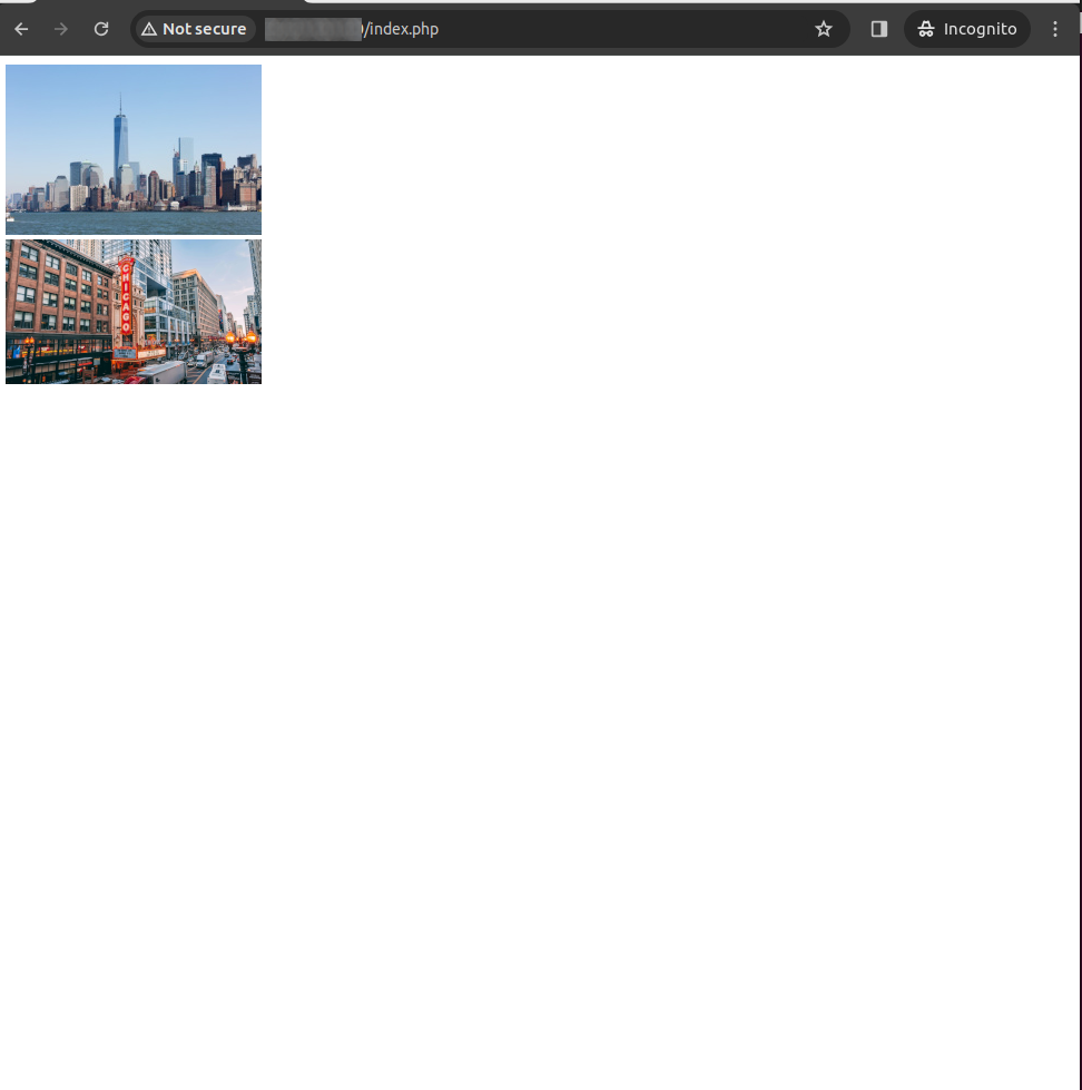
To create an image grid, we'll use the <div> element to create a container to hold the images. Inside this container, we'll place additional <div> elements, each containing an image. Here's a simple example:
<div class="image-grid">
<div class="image-item">
<img src="image1.jpg" alt="Image 1">
</div>
<div class="image-item">
<img src="image2.jpg" alt="Image 2">
</div>
<!-- repeat for each image -->
</div>
In this example, the 'image-grid' class is attached to the container <div>, and the 'image-item' class is attached to each image's <div>. These classes will be used in the next step when we apply CSS styles to the grid.
Use CSS to Style the Grid
Now that we have our basic HTML structure, it's time to style our image grid with CSS. CSS allows us to control the layout, colors, fonts, and other visual elements of our webpage.
We can start by giving our image grid a fixed width and using the 'display' property set to 'grid'. This will ensure that our images are aligned in a grid layout. We can also use the 'grid-template-columns' property to specify how many columns our grid should have.
.image-grid {
width: 100%;
display: grid;
grid-template-columns: repeat(auto-fill, minmax(250px, 1fr));
gap: 10px;
}
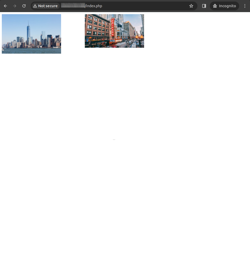
In the above CSS, 'repeat(auto-fill, minmax(250px, 1fr))' will create as many columns as can fit in the container without each column being less than 250px. If the container can't fit another 250px column, it will adjust the size of the existing columns to fill the container's width.
The 'gap' property is used to create some space between images.
Use Media Queries to Adjust Grid Layout on Different Screen Sizes
While our image grid is now responsive to the container's width, we want to make sure it also looks good on different screen sizes. To do this, we can use media queries. Media queries are a CSS technique that allows us to apply different styles for different media types or screen sizes.
@media (max-width: 600px) {
.image-grid {
grid-template-columns: repeat(auto-fill, minmax(200px, 1fr));
}
}
This media query will apply if the width of the viewport is 600px or less. It reduces the minimum column width to 200px, allowing for more columns and a better fit for smaller screens.
Bonus: Automatically Cropping Images to Fit
When using a responsive image grid, you may find that some images don't quite fit the grid cells perfectly. One way to tackle this issue is to automatically crop the images using CSS.
.image-item img {
width: 100%;
height: 100%;
object-fit: cover;
}
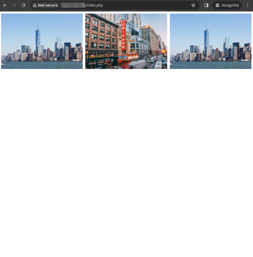
Note: The third image in the above grid is over 300px wide.
In the above CSS, the 'object-fit' property set to 'cover' will scale the image to cover the entire width and height of its box, while maintaining its aspect ratio. This will effectively crop the image to fit the grid cell, ensuring a neat uniform look for your image grid.
In conclusion, creating a responsive image grid may seem complex, but with a basic understanding of HTML and CSS, it's a task that can be accomplished with a few lines of code. it's a versatile tool that can greatly improve the user experience on your website, making it more accessible and visually appealing. So go ahead and give it a try!


